Prework - Network Visualization
Before you arrive at RMBL.
Intro to network data visualization.
Watch this quick video (5:24 min.).
Overview
There are two basic ways of visualizing networks:
- network diagrams (which show nodes as shapes, and links as lines between nodes)
- matrix format (where each node is a row and/or a column, and interactions are denoted in the cells aligned with a given row and column)
While understanding those two basic formats is foundationaly important for working with networks, visualization is a large and complex topic, so we will only cover a bare minimum here.
Basics
We will largely focus on using the bipartite library and its plotting functions. bipartite is great in lots of ways and its plotting methods are functional, though certainly far from amazing. There are alternative R packages that also allow for plotting, for example the igraph library; but we will leave that to you to explore if you are interested.
bipartite has two primary functions for plotting networks, that align with the two basic ways of visualizing networks we mentioned above:
- for network diagrams, the
plotweb()function - for matrix depictions, the
visweb()function
Network diagrams
We’ll use data that are included in the bipartite package for our plotting exercises. We’ll start with the Safariland dataset, collected at a theme park in Argentina by Diego Vázquez and collaborators, because it’s a small and straightforward dataset to visualize.
library(bipartite)
library(kableExtra) # for nicely-formatted tables
data(Safariland)
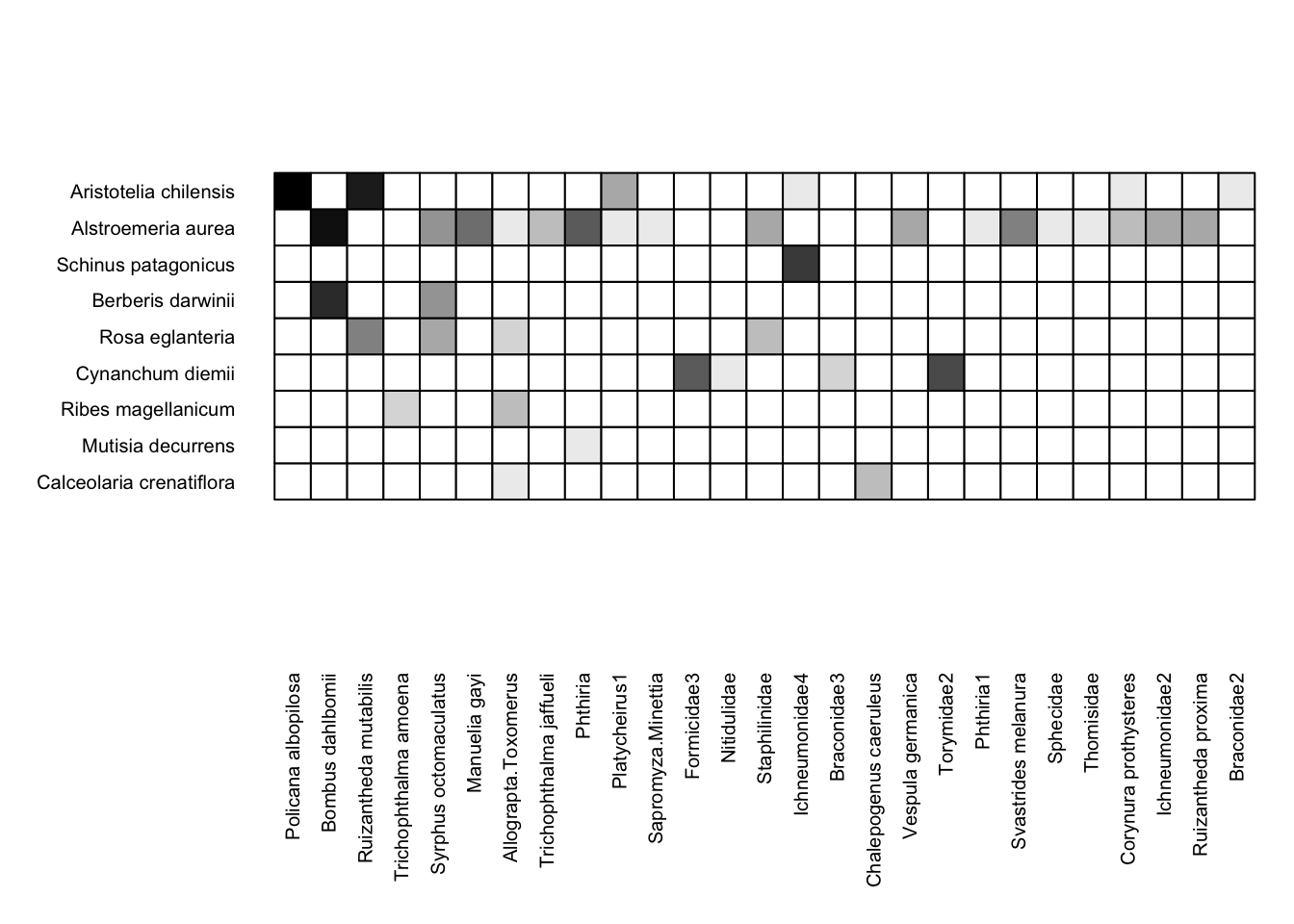
Before we plot it, let’s take a look at the data, so we can have a better sense of what we’re visualizing. Let’s look at the first 8 columns (pollinators) to have it fit relatively easily on the page:
# show in nicely-formatted table:
kable(Safariland[,1:8], row.names = T) %>%
  kable_styling(full_width = T,
                position = "left",
                bootstrap_options = "condensed")
| Policana albopilosa | Bombus dahlbomii | Ruizantheda mutabilis | Trichophthalma amoena | Syrphus octomaculatus | Manuelia gayi | Allograpta.Toxomerus | Trichophthalma jaffueli | |
|---|---|---|---|---|---|---|---|---|
| Aristotelia chilensis | 673 | 0 | 110 | 0 | 0 | 0 | 0 | 0 |
| Alstroemeria aurea | 0 | 154 | 0 | 0 | 5 | 7 | 1 | 3 |
| Schinus patagonicus | 0 | 0 | 0 | 0 | 0 | 0 | 0 | 0 |
| Berberis darwinii | 0 | 67 | 0 | 0 | 5 | 0 | 0 | 0 |
| Rosa eglanteria | 0 | 0 | 6 | 0 | 4 | 0 | 2 | 0 |
| Cynanchum diemii | 0 | 0 | 0 | 0 | 0 | 0 | 0 | 0 |
| Ribes magellanicum | 0 | 0 | 0 | 2 | 0 | 0 | 3 | 0 |
| Mutisia decurrens | 0 | 0 | 0 | 0 | 0 | 0 | 0 | 0 |
| Calceolaria crenatiflora | 0 | 0 | 0 | 0 | 0 | 0 | 1 | 0 |
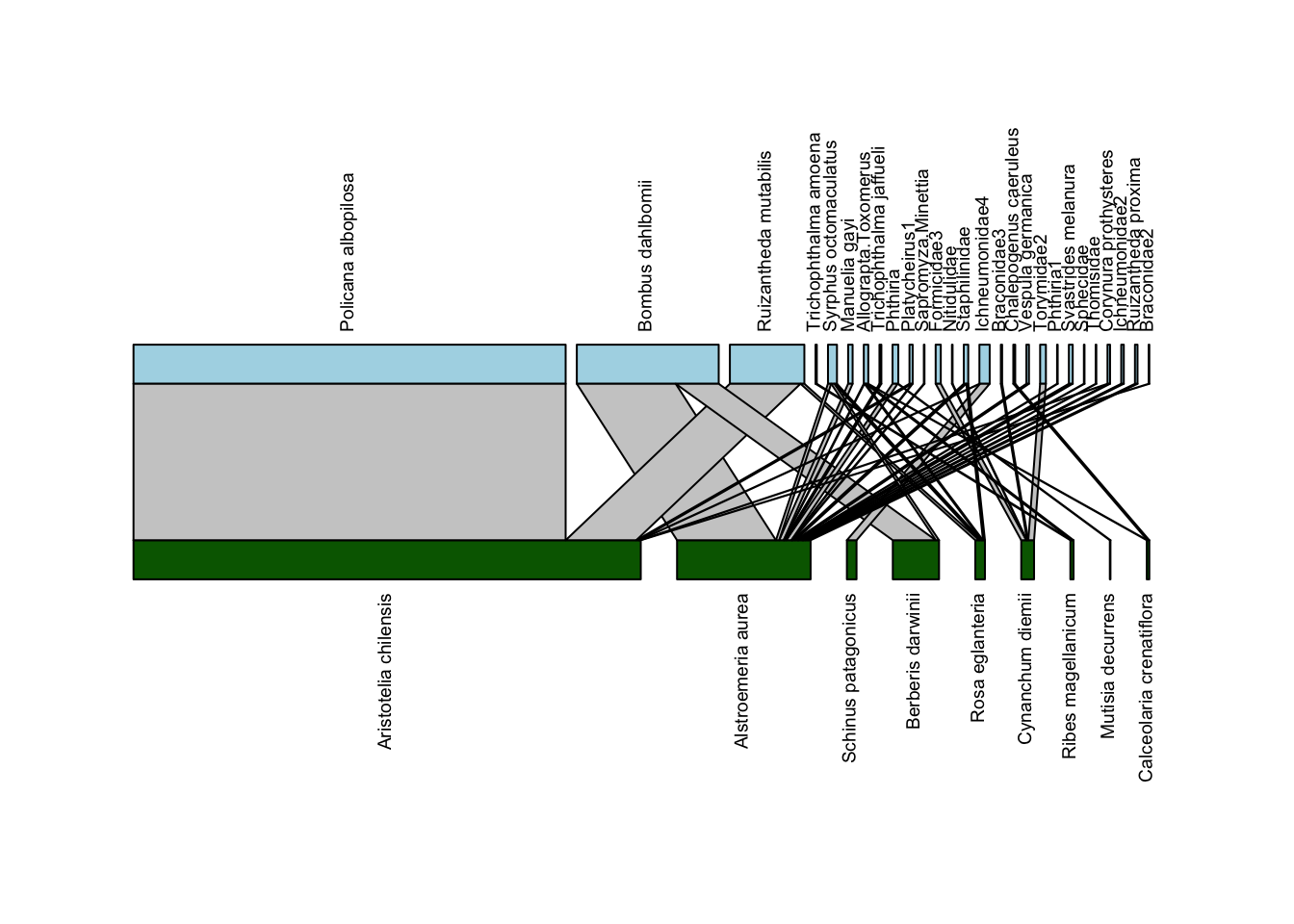
Let’s get right to the visualization! It’s easy to use the plotweb() function to plot a network diagram:
plotweb(Safariland)
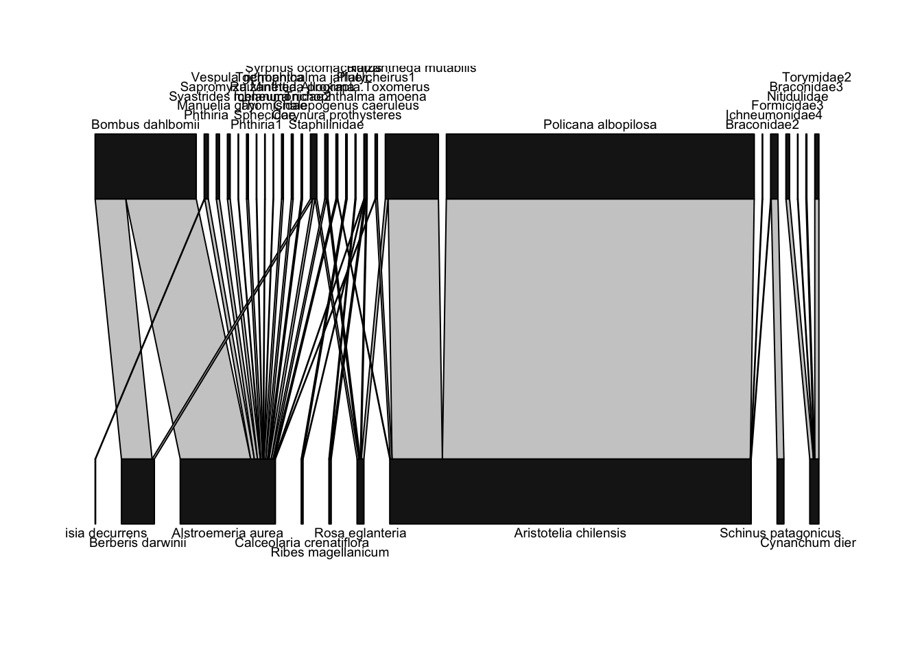
Above, we defined a network diagram as showing “nodes as shapes, and links as lines between nodes”. For the nodes, plotweb() depicts nodes as rectangles; the wider the rectangle, the more interactions were recorded for that node. Plants are shown on the bottom, since they’re the “lower” (closer to basal energetically) level, and thus pollinators are shown on the higher level. For the links, they are also shown with widths scaled by the number of interactions.
For example, there were many, many interactions between the plant Aristotelia chilensis (also known as maqui or Chilean wineberry, whose fruit has recently been marketed as a “superfood”) and Policana albopilosa, a pretty Diphaglossine solitary bee whose genus name has been updated to Cadeguala. Thus, the line connecting these species is very wide (in fact, this link accounts for almost 60% of the observed interactions in this network). Many of the other interactions were only a single observation of that pollinator on that plant; those interactions are depicted by very narrow lines.
You many notice that this plot is kind of hard to read. In particular, a lot of the pollinator names overlap each other. We can do some minor tweaks to the plot and make it easier to interpret pretty easily. Let’s rotate the plant and pollinator names to vertical positions, so they don’t overlap, and change the colors of the nodes so that plants are green and pollinators are blue:
plotweb(Safariland,
        text.rot=90,
        col.low = "darkgreen",
        col.high = "lightblue")
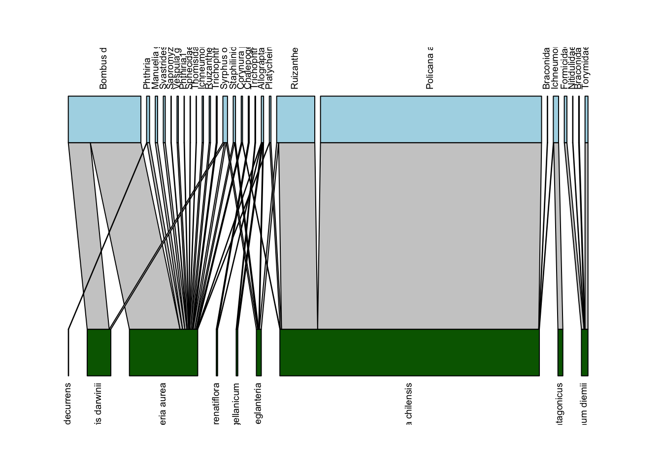
Well, that is kind of better… though now all the labels are cut off. We can adjust that with the y.lim option in plotweb(); in my experience you just have to iteratively mess around with the lower and upper limit numbers (y.lim=c(-0.75,2.75) in the code below) until you get a combination that works:
plotweb(Safariland,
        text.rot=90,
        col.low = "darkgreen",
        col.high = "lightblue",
        y.lim=c(-0.75,2.75))
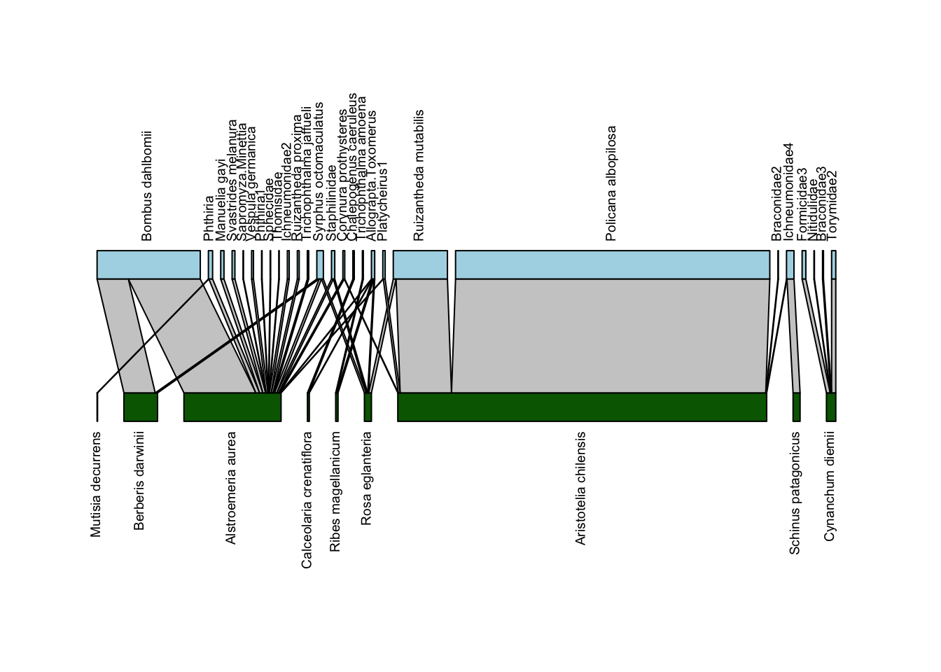
Now we have a pretty solid bipartite network depiction. We’ll play around with just one more argument to this function: method which sets the arrangement of plants and pollinators. The default is cca which “leads to as few crossings of interactions as possible”. Below we’ll plot it with method = "normal" which will leave the order the same as in the data:
plotweb(Safariland,
        method = "normal",
        text.rot=90,
        col.low = "darkgreen",
        col.high = "lightblue",
        y.lim=c(-0.75,2.75))
It’s helpful to see the rearrangement, and you could always go back into your data and rearrange them if you wanted a particular order (more on that below).
While again bipartite provides a decent starting point for plotting network diagrams, if you want to do a deep dive into network plots that are more customizable etc, we suggest looking into other packages such as igraph.
Matrix depictions
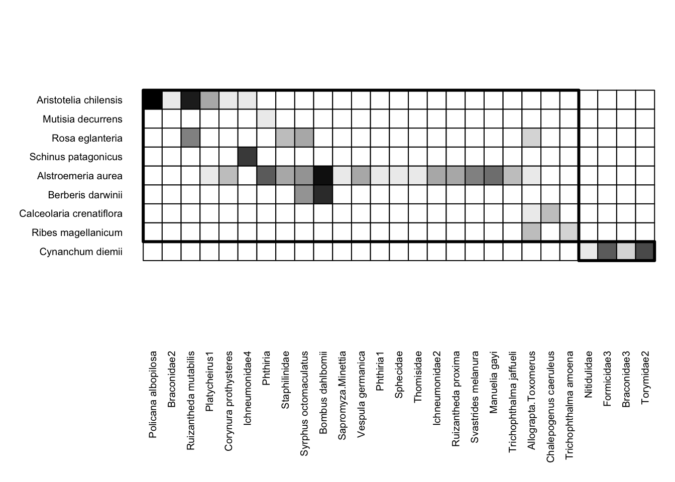
We’ll now shift gears from network diagrams to matrix depictions. Here is an example matrix depiction of the Safariland dataset:
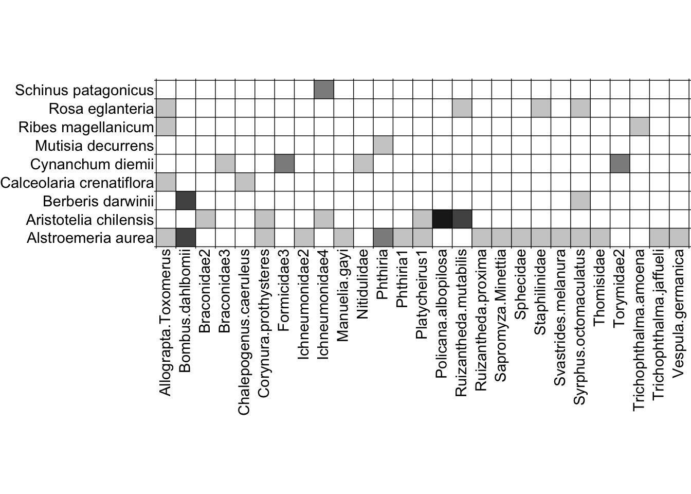
visweb(Safariland)
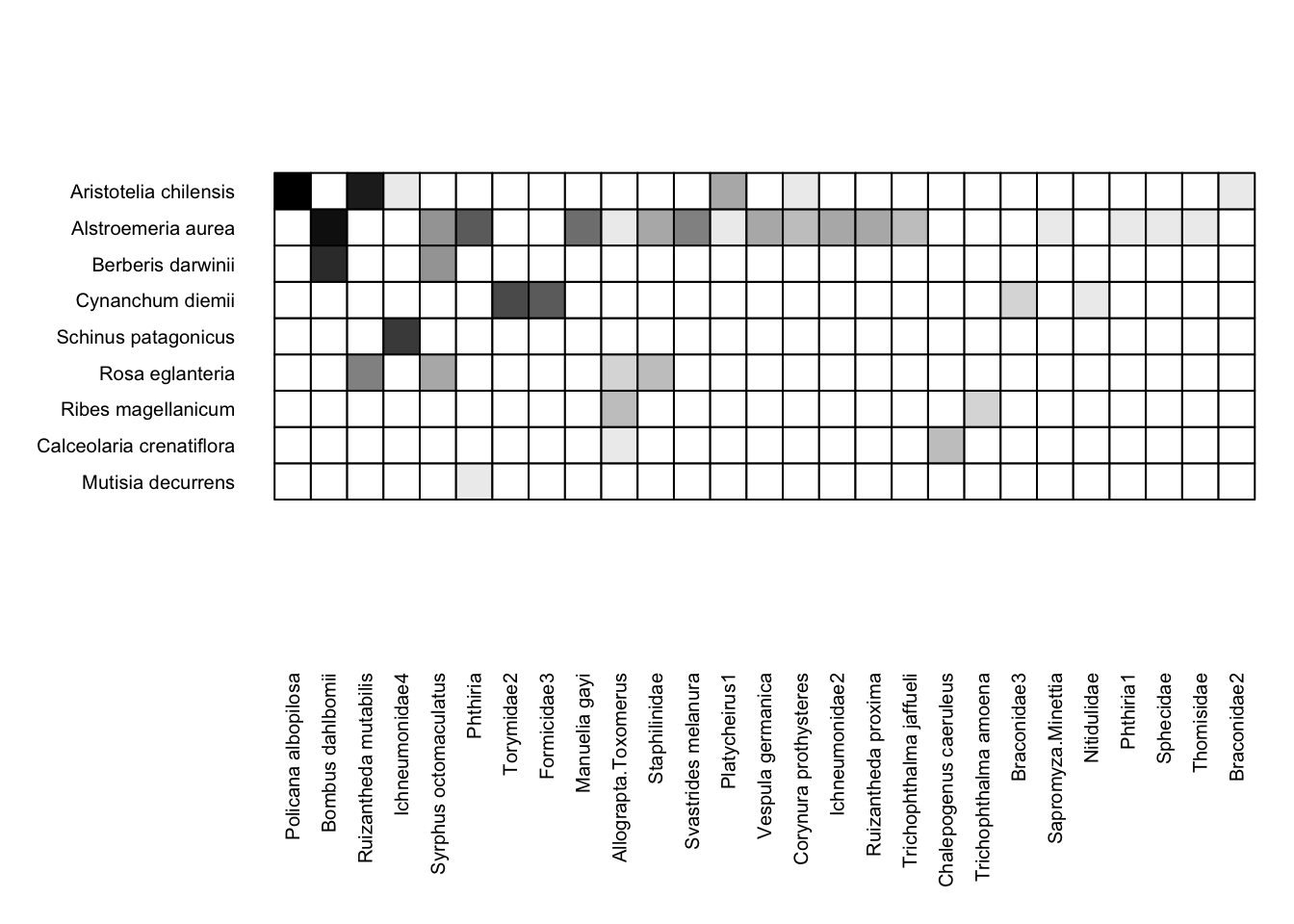
With the simplest function call (i.e. no alterations to the default arguments), visweb() gives us a solid depiction of this network. Yeah, I know—there’s a gap between the matrix and the pollinator labels, which is standard with visweb. We’ll come back to some alterations shortly.
Standardizing Matrix Depictions
What is the difference between these two matrices?
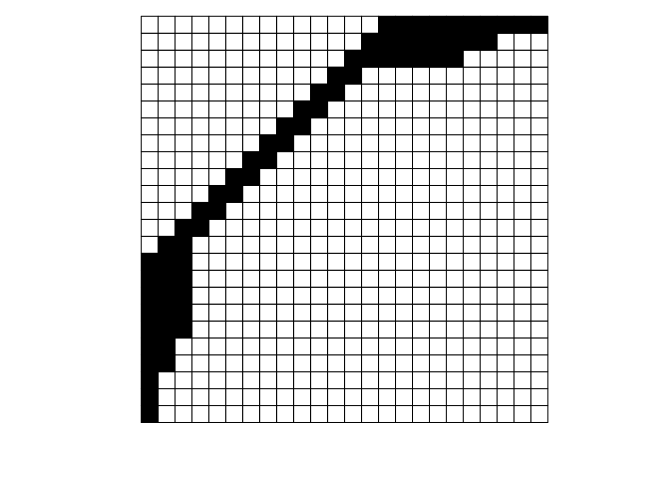

They look pretty different, huh? The second one gives off some distressed Jack-O-Lantern vibes…
Perhaps surprisingly, these are two different visualizations of the exact same network! How can that be?
Ultimately, as long as each interaction (data in a cell) is recorded faithfully (i.e., maintains the association between its row / plant and its column / pollinator), we can move around the order of entire rows and entire columns (relative to each other) and the data remains the same: it is still the same network. If we re-plot the two figures above, including the row and column labels, we can perhaps see that more easily:
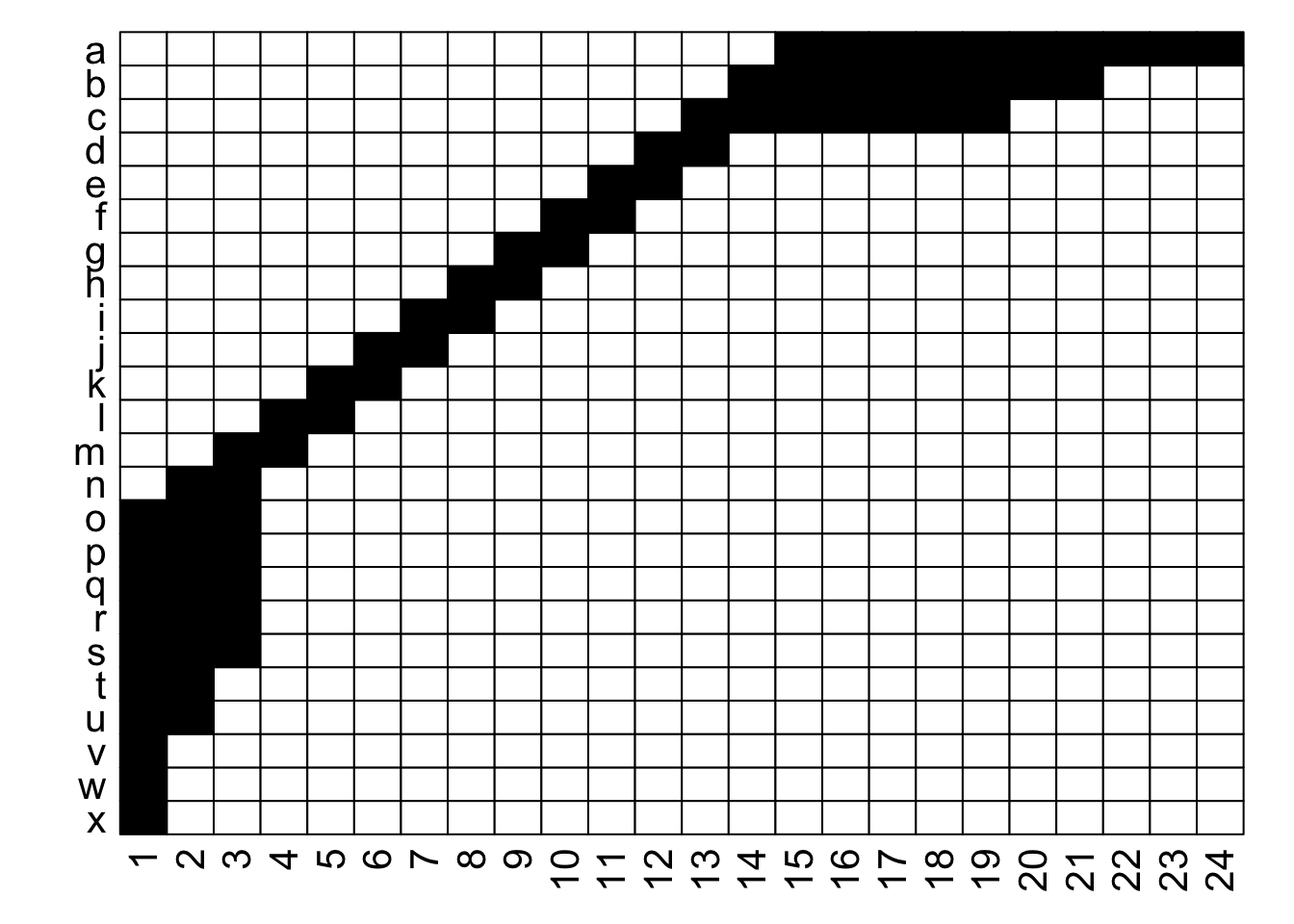
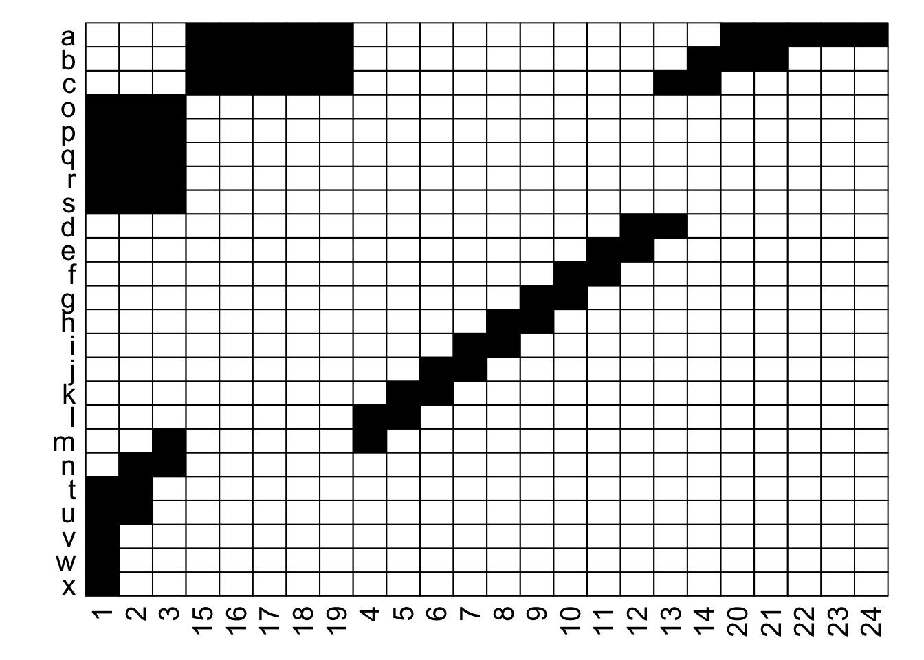
With the row and column labels, you can confirm that the integrity of each interaction is maintained through both of these depictions.
For example, row j interacts with column 7 in both depictions, and you could hypothetically go through and confirm that for each of the 69 unique interactions in this made-up example (if you were really bored, that is). To get more detailed without having to go interaction-by-interaction, row a interacts with columns 15 through 24, and this is easy to confirm in both graphs; it’s just that the column order is different between the two.
Thinking about this, there is a very large number of ways that we could depict the same network… if R were the number of rows and C the number of columns, then we could represent that network in $R! \times C!$ ways. For the example above with 24 rows and 24 columns, that is 24! $\times$ 24!, or more than 3 $\times$ $10^{47}$. In other words, an unfathomably gigantic number of ways. Put another way, for a 100 $\times$ 100 network, this value is too large for R to calculate.
With so many potential options, we would ideally like to have a way to standardize how we depict a network in terms of the arrangement of the rows and columns.
How to standardize
Thankfully, there is a clear option in this regard (at least when it comes to bipartite networks): we sort the rows and the columns of the matrix by the degree or number of unique connections that each node has. We sort such that the most-generalist (highest degree) row is at the top, and the most-generalist column is at the left. This depiction maximizes our ability to detect nestedness in our networks, and some researchers refer to this arrangement as “packing” a matrix.
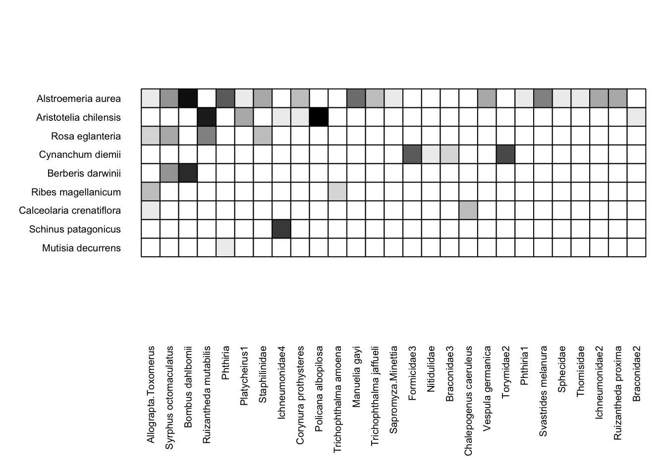
The visweb function includes options for how you display a network. Here is what the Safariland dataset looks like if the rows and columns are plotted in the order they are in the dataset (i.e. no rearrangement):
visweb(Safariland, type = "none")
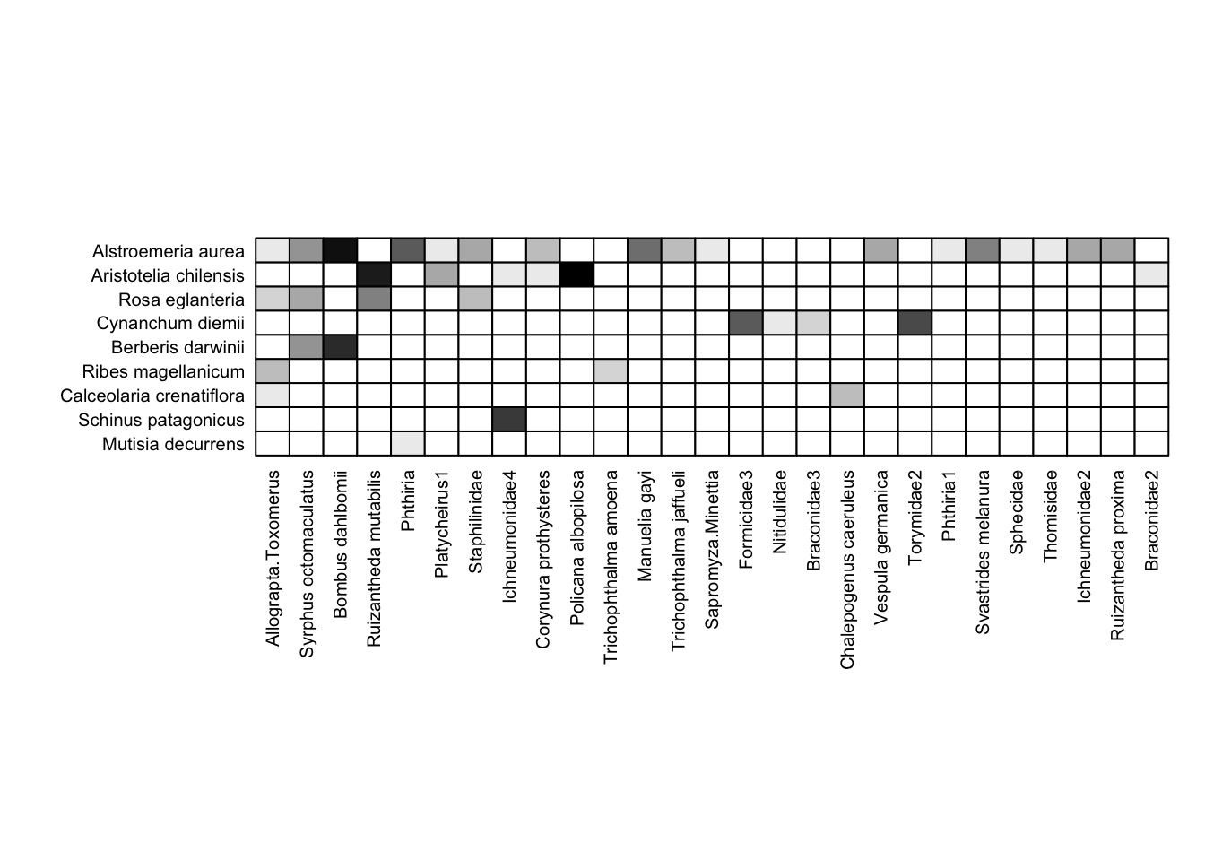
If we wanted to standardize (order the rows and columns) by the total count of interactions for each taxon, we could instead use the bipartite default:
visweb(Safariland, type = "nested")

This plot is exactly the same as the first plot of the Safariland data, but slightly different than the plot just before it (you can see some minor differences between the two plots, but they’re pretty subtle). This isn’t unusual, because common interactions are probabilistically likely to appear earlier in datasets, so often the order that data are in (e.g. from field notebooks) is correlated with—but not usually exactly the same as—the order of the same data that are sorted by number of interactions.
Unfortunately, the visweb() default is not really the ideal way to see nestedness, which is instead to sort by degree or number of links per node (not total number of observed interactions). Because of this, many researchers in the bipartite network realm strongly prefer to order by degree instead of interaction count. To do that, you’ll have to code it yourself. It’s really not hard; some example code is below (and for aficionados of concise code, it would be straightforward to collapse this down into three lines of code).
rowz = rowSums(Safariland>0)                # calculate plant degrees
colz = colSums(Safariland>0)                # calculate pollinator degree
roworder = order(rowz, decreasing = TRUE)   # order plants by degree
colorder = order(colz, decreasing = TRUE)   # order pollinators by degree
Safariland = Safariland[roworder, colorder] # re-order rows and cols in matrix
We’ve now rearranged the row and column order in the Safariland dataset, so to plot it, just use type = "none":
visweb(Safariland, type = "none")
Now that we’re reordered our data, we can also use the reordered data to visualize a network diagram via plotweb(). In fact, we’ll use the exact same code as above, with method = "normal"; but because we have rearranged the underlying data, the plot will be different:
plotweb(Safariland, method = "normal", text.rot=90,
        col.low = "darkgreen", col.high = "lightblue",
        y.lim=c(-0.75,2.75))
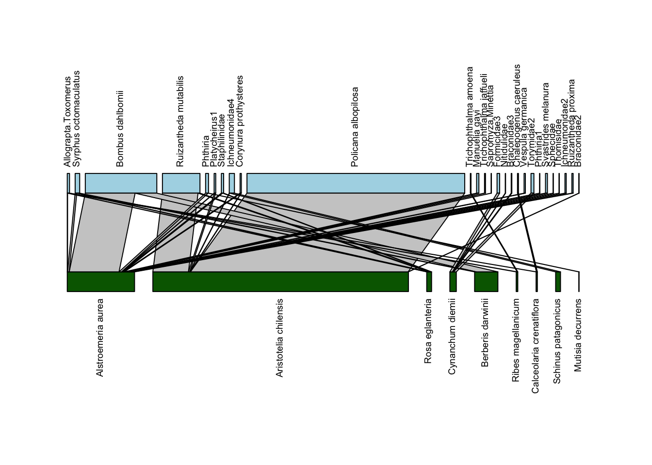
In this plot, the plant and pollinator species that have the highest degree (largest number of unique interactions with species in the other group) are on the left, with degree decreasing as we move to the right. With this arrangement, we can see more clearly some of the hallmarks of nestedness: sharply sloping lines connecting generalists from one group (say plants) with specialists of the other group (pollinators), and vice-versa. In addition, we don’t see many vertical lines at the right edge of the plot; such vertical lines indicate interactions occurring between specialists, which we don’t typically find in nested networks.
At the same time, one can see why the default plotting option with plotweb is what it is; with this arrangement it’s harder to trace the lines between interacting species to understand who is interacting with whom.
Diagonal arrangement
Back to matrix depictions: finally, visweb includes a third option, “diagonal” arrangement, which maximizes the number of interactions occurring along the diagonal of the bipartite matrix. While a non-standard way to depict matrices, it can be helpful for visually assessing modularity or compartments in the matrix. You can do that via type = "diagonal":
visweb(Safariland, type = "diagonal")
Here, visweb() shows us that there is one clear module in the network: the plant Cynanchum diemii is visited by four different pollinator taxa (two beetles and two wasps) that weren’t recorded visiting any other plants. The rest of the network shows up as a separate and much more diffuse module.
One thing to know about using type = "diagonal" is that the algorithm is stochastic, so the plot could be different each time. For example, for the plot above, the Cynanchum diemii module can appear either at the top or the bottom.
Limitations and alterations to visweb
visweb is a great starting point for bipartite network visualization. It’s straightforward to use, and because its use is almost ubiquitous among network ecologists, you and many others are probably familiar with the plotting style. Still, it has some limitations.
For example, you’ve likely noticed that the default output for visweb() for the Safariland dataset yields a strange gap between the bottom of the matrix and the x-axis labels. This is typical with visweb() and can happen on the y-axis as well. Unless your matrix is very nearly square, you typically end up with a gap. Moreover, while there are some elements you can adjust, these plotting methods are not particularly flexible.
Below the visualization exercises we’ve included some code for 1) fixing the issue with label spacing using the gridGraphics package; and 2) “starter” code for plotting matrix depictions with ggplot2, which is extremely customizable. Before you go there, though, do some practice with the exercises below:
Exercises
For those new to plotting networks
Use the medgarden.csv data you put into matrix form in the “Edgelist to Network” section of our workshop Pre-work.
- plot via
plotweb:- with no alterations; then
- rotate text to 90º and get all of the labels to fit
- change the colors of the plant and pollinator rectangles
- plot via
visweb:- with
type = "none" - with
type = "nested" - with
type = "diagonal"
- with
- “pack” (re-order) the matrix by plant and pollinator degree using the code included above (or your own variant if you prefer)
- re-plot with
visweb, usingtype = "none" - re-plot with
plotweb(with all of the alterations listed above)
- re-plot with
If you’d like more practice, you can also use with some of the data included in bipartite, e.g. barrett1987, elberling1999, memmott1999, or motten1982 among others.
For those with experience plotting networks
Choose your own plotting adventure! Pick one of the datasets included in bipartite (e.g. memmott1999) or use your own data or other data (e.g. from the Web of Life database).
Some ideas—do what you are interested in:
plotweb- “pack” the data
- compare a “standard” quantitative plot to a presence-absence plot where you transform all of the non-zero elements in the dataset (or preferably a copy of it) into 0s and 1s (hint to do this: logical data (T/F) in R are stored as 0/1 and can be multiplied, say, by 1)
- play around with other formatting options (see
?plotweb)
visweb- plot with and without “packed” data
- play around with some of the color options, e.g.:
square="b",box.col="lightblue"; see?visweb - use example code below with
gridGraphicsto fix the text spacing issue in a network that is far from square - if you’re a
ggplotaficionado, use the code below as a starting point to plot a network usinggeom_raster
Alterations
Grid Graphics
Below is code using the gridGraphics library to make the labels on visweb work better. This code works, but it’s far from intuitive; for any plot you’re adjusting you’ll need to play around with the labsize and spacing (e.g. unit(0.15, units = "in")) to get it to plot the way you’d like.
library(gridGraphics)

# port `visweb` output into a grid graphics object:
my_gTree <- grid.grabExpr(grid.echo(
  function()
    visweb(
      Safariland,
      type = "none",
      prednames = TRUE,
      preynames = TRUE,
      labsize = 1
    )
))
# shift the left axis labels to the right
my_gTree[["children"]][["graphics-plot-1-left-axis-labels-1"]][["x"]] <- unit(0.15, units = "in")
# shift the bottom axis labels upwards
my_gTree[["children"]][["graphics-plot-1-bottom-axis-labels-1"]][["y"]] <- unit(1.3, units = "in")
grid.newpage()
grid.draw(my_gTree)
Definitely better than the base output; though note that I also had to play around with the out.height argument in the code chunk header to get this to print with a reasonable aspect ratio.
ggplot geom_raster
Note that this code is fairly rudimentary; it’s intended to be a starting point, rather than a fully-worked out solution. If you’re keen to plot networks in ggplot, you can take this code and run with it. If you’re not keen to do that, it’s best to stick with bipartite or another solution.
Many of you may be familiar with using the ggplot2 library (also included in the tidyverse) as a way to plot data. The geom_raster geom in ggplot2 is a way to plot matrix depictions while keeping it straightforward to customize the plot in any number of ways (assuming you are familiar with ggplot2!).
In contrast to the bipartite plotting method, ggplot2 requires that data are in a “tidy” data format (i.e. a data frame, not a network matrix). Our pre-work module on converting edge lists to networks gives some background on converting between these types. The code below assumes you have a network data matrix and converts it back to a dataframe, using pivot_longer (the opposite of the pivot_wider we used to move the data in the other formatting direction in the module on converting edge lists to networks).
The code below is set up as a function, so that you can include a matrix in the function argument and get a ggplot plot object back.
Some notes about working with geom_raster and the code below:
- when converting from a matrix into a data frame, any ordering is lost; if you want to “pack” your matrix, you have to sort your data by both the pollinator and the plant columns.
- There are workarounds for specifying plotting order of discrete variables in
ggplotso this is not insurmountable - The code below doesn’t do this; it’s in alphabetical order instead because of
pivot_longerdefaults.
- There are workarounds for specifying plotting order of discrete variables in
ggplotuses the bottom left corner of a plot as the starting point, unlikebipartitewhich uses the top left. In other words, plants coming first in data order will be plotted at the bottom. So if you do “pack” your data frame, you’ll want to sort the plants in reverse order (but pollinators in the typical order)- You’ll notice in the plot below that plants are actually in reverse alphabetical order because of this
- Sorting these data is tricky, however, since we only end up with a single column of data (interaction count for a given plant-pollinator pair). One workaround is to use
dplyrto create new columns withsummarizethat tallies interactions on a per-species basis, for both plants and pollinators. Then you can sort the data by those columns. (Again, this is not done below)
- using plot defaults, raw network data, and
scale_fill_gradienttypically means that most interactions will be shaded so subtly as to not be noticeable.- a workaround is to set 0 values to
NA, and usescale_fill_steps, specifyingna.value = "white"and (e.g.)low = "#EEE"(#EEEis a very light grey) - for this to work well, you’ll likely need to either transform the data or manually specify how to set the gradient, since most ecological network datasets have a lot of rare interactions and a few very common ones. Again, otherwise variation among relatively rare interactions will be difficult to parse visually.
- In the code below, we opted for log-transforming the data to get more of a gradient; that’s a reasonable approach but there are many other possibilities.
- a workaround is to set 0 values to
- gridlines are a little… strange in
geom_raster; they are set for theggplotdefaults of plotting gridlines on integers (which of course makes sense for most plots), but that is actually right through the middle of our grid cells (and to be honest, any grid cell one might use ingeom_raster). Instead, we want to plot the gridlines on the 0.5 marks.- The workaround we used below is to specify these with
geom_hline, but it can probably be done withpanel_grid_major(orpanel_grid_minor).
- The workaround we used below is to specify these with
Again, the code below is intended only as a starting point! Take it and run with it.
# convenience function for matrix plotting
#----------------
# takes a matrix as an argument; conducts pivot_longer
# to make it plottable by ggplot

matplotter = function(X){
  require(tidyverse)
  AR = nrow(X)/ncol(X) # calculate aspect ratio
  dat = data.frame(X)
  # move plant (row) names to their own variable (column):
  dat$rowz = row.names(dat)
  # pivot longer
  long = pivot_longer(dat,
                      cols = !rowz,
                      names_to = "colz",
                      values_to = "n")
  # convert 0s to NAs for plotting
  long$n[long$n==0] <-NA
  # log transform data for better visualization of the quantitative gradient
  long$n = log(long$n)
  # plot using geom_raster
  p = ggplot(long, aes(x = colz, y = rowz)) +
    geom_raster(aes(fill = n)) +
    scale_fill_steps(low="lightgray", high="black", na.value = "white") +
    theme_void() + # removes grid, axis ticks, etc. etc.
    theme(
          legend.position = "none", # remove legend
          aspect.ratio = AR*0.95, # keeps it square (-ish)
          axis.text.x = element_text(angle = 90,
                                     hjust = 1, # align at the top
                                     vjust = 0.4), # align in the middle
          axis.text.y = element_text(hjust = 1),
          ) +
    # manually add gridlines back in (probably a more elegant way to do this)
    geom_hline(yintercept = 0.5 + 0:(length(unique(long$rowz)) + 0.5),
               colour = "black", linewidth = 0.25) +
    geom_vline(xintercept = 0.5 + 0:(length(unique(long$colz)) + 0.5),
               colour = "black", linewidth = 0.25)

  return(p)
}

# test the function with the "Safariland" data
testplot = matplotter(Safariland)
testplot